type species posters
(helvetica)
Date
January 2025
Media
Adobe Indesign
10.25x16.25"/pg
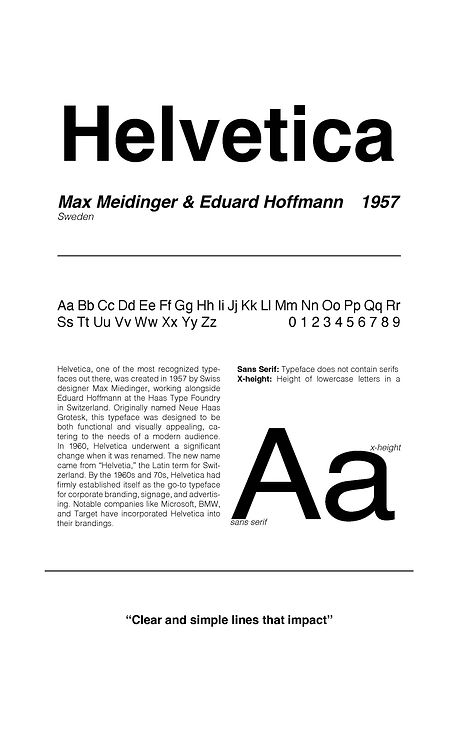
After being assigned the typeface Helvetica, I conducted thorough research into its history and usage. I created a series of three posters that increasingly embraced a maximalist and "chaotic" aesthetic. The first poster was straightforward, reflecting Helvetica's clean and simple sans serif nature, making the design process seamless. My favorite, which also resonated with my classmates and teacher, was the mid-ground poster, striking a perfect balance between minimalist and maximalist elements. I used a calming green and a subtle off-white as the main colors. For the final poster, I fully embraced maximalism, incorporating conflicting elements, overlapping layers, and strategically scattered details. I also chose to use a vibrant red, and pitch black as the primary colors, contributing to the bold nature of maximalism. This assignment was incredibly enjoyable as it challenged me to explore different design styles that used the same information.

